Your main task in creating any visualization is to try to make it understandable. Making it understandable includes a lot of things, from the choice of metrics to the design. Ideally, everything should be visually familiar, clear and simple.
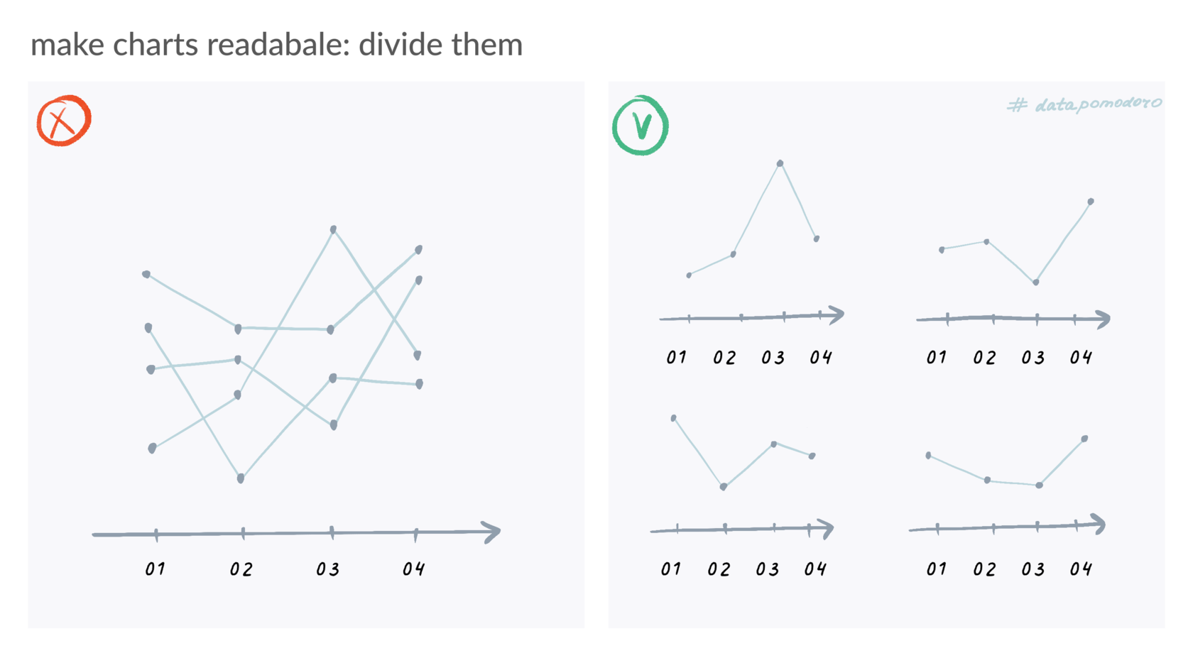
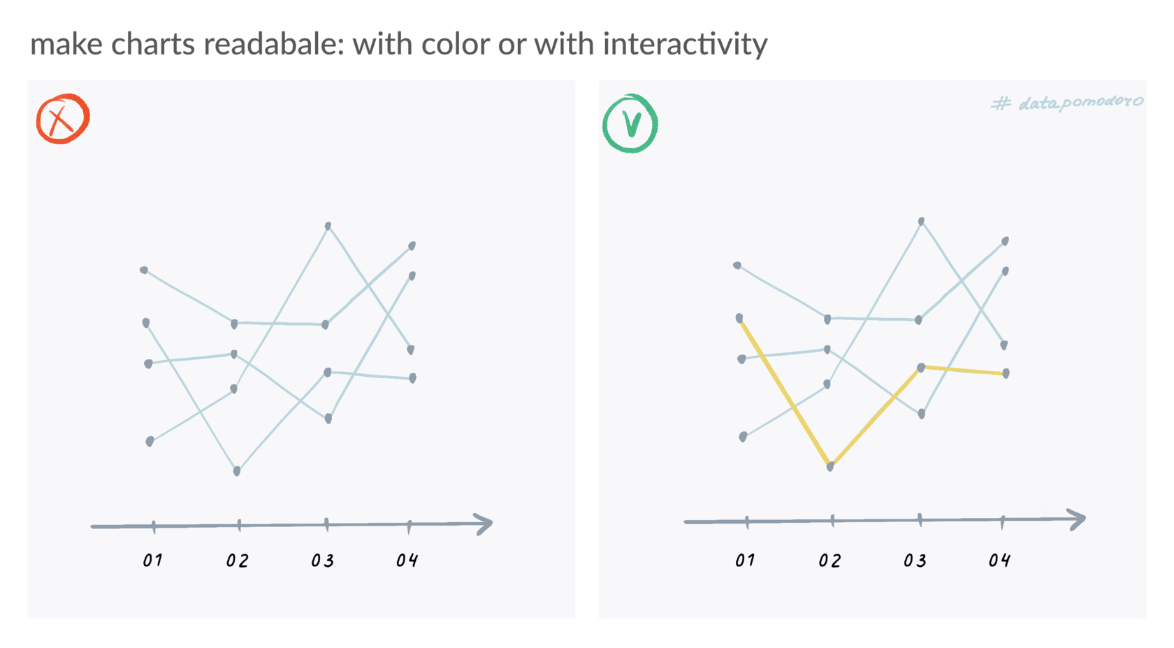
Spaghetti Chart is the term for a line chart that shows really lots of lines – usually more than 7 categories. The lines get tangled up with each other like spaghetti. Because of this, it is difficult to follow the trend of each category and it is difficult to pick out the necessary patterns. You get something not readable.
Solution 01: try to divide the pasta plate into separate spaghetti using several individual small charts. This method is called small multiples and it is best if it is more important for you to see how each individual category changes than to compare them to each other.

Solution 02: If cross-comparison on a common axis is important, then add accent color or interactivity. Make it possible to visually distinguish one category from another.

